
How to Make Your Data Insights More Practical and Tell Better Stories With Your Analysis
When we talk about “data storytelling,” it’s easy to imagine charts, dashboards, or polished presentations. But at the core, storytelling in analytics is about something much simpler: giving numbers meaning.
A useful way to think about this is that every metric contains three layers:
- What the number says
- What the number means
- Why the meaning matters for the decision
Stronger insights come from moving beyond layer one.
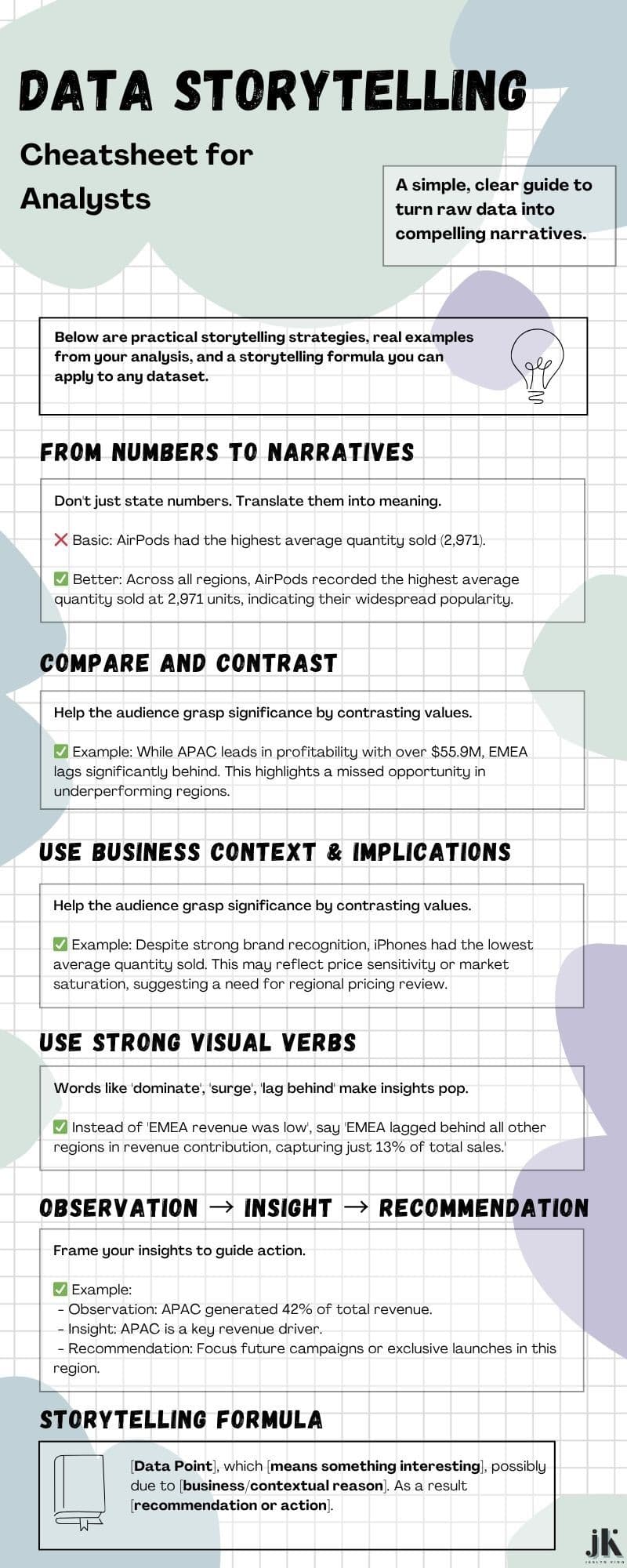
1. Start With the Observation — Then Ask “So what?”
Here’s a simple way to think about the transition from reporting to insight:
- Reporting describes what happened.
- Analysis explains why it happened.
- Storytelling connects it to a business decision.
Take a basic statement like:
“AirPods had the highest average quantity sold.”
The improved version works because it answers the next question: why does that matter?
By tying the quantity to popularity, demand patterns, or price sensitivity, the insight becomes something a business can use — not just something it can read.
2. Use Contrast to Create Meaning
Contrast is one of the simplest storytelling tools. When you compare regions, products, or time periods, you highlight patterns the reader can act on.
For example, noting that APAC far outperforms other regions doesn’t just present a number — it reveals a gap. And gaps naturally lead to questions about opportunity, strategy, or risk.
Contrast transforms static data into directional insight.
3. Bring in Business Context
Data becomes practical when it intersects with how the business actually operates.
If iPhones have lower average quantity sold, that’s not just a metric — it’s a potential signal of pricing challenges, market saturation, or shifting customer behavior. Context turns numbers into strategic levers.
A simple way to check yourself is to ask:
- What business assumption does this data support or challenge?
- What might this reveal about customers, operations, or pricing?
4. Use Clear, Visual Language
You don’t need dramatic phrasing — just verbs that help the reader see movement:
- “leads,” “lags,” “outpaces”
- “indicates,” “suggests,” “underscores”
These words guide interpretation without adding hype. They help business stakeholders understand the shape of the data — not just the value.
5. Structure Your Insight for Action
A helpful pattern is:
Observation → Insight → Recommendation
For example:
- Observation: “APAC contributed over $55.9M in total profit.”
- Insight: “It significantly outperforms all other regions.”
- Recommendation: “Increasing investment here could elevate company-wide profitability.”
This structure gives your audience something to understand and something to do next.
A Simple Template You Can Use
“[Data point], which [reveals meaningful interpretation], possibly due to [context or business reason]. As a result, [action or recommendation].”
This keeps your insights grounded, structured, and directly useful.
The takeaway
Practical data storytelling isn’t about embellishment. It’s about clarity.
When you translate numbers into meaning — and tie that meaning back to the decisions people need to make — you move from reporting data to revealing insight.
That’s the shift that turns an analyst into a strategic partner.
Recommended References
- Knaflic, C. N. (2015). Storytelling with data: A data visualization guide for business professionals. Wiley.
- Evergreen, S. D. H. (2016). Effective data storytelling: How to drive change with data, narrative and visuals. Sage Publications.
- Duarte, N. (2010). Resonate: Present visual stories that transform audiences. Wiley.
- Cole, N. (2022). How to Tell a Story with Data. Harvard Business Review. Retrieved from https://hbr.org/2022/03/how-to-tell-a-story-with-data
- Few, S. (2009). Now you see it: Simple visualization techniques for quantitative analysis. Analytics Press.